UX 工具集:从商业分析到产品设计方法论总结
此文篇幅较长,建议你有足够空闲时间阅读(Ctrl+D 添加浏览器收藏),开篇简单介绍UX设计的大致流程,然后再详细叙述。
一直想整理完整的有关UX设计的文档信息,年中因为工作原因在小组内部进行分享的准备中找到来自 @maitedalila 整理过的资料1 。而这些也正式我想整理的有关UX设计、启发式评估,以及产品设计工作流相关的文档。于是抽空做了一点翻译工作,但原文依旧保留,同时建议用户更多的去看原文,毕竟每个人的译述水平有限,理解上也存在偏差。
1 本文将收集参考一些国外产品经理、UX等的资料进行整理输出。
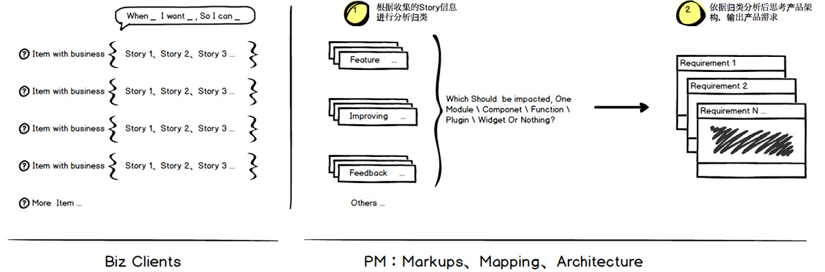
当发现自己需求池列表很多时,需要开始反思。上面是其中一个方法:多个用户story经过产品思维消化应该转换成更少的requirement。
设计流程(Design Process)
商业分析 (Business Analysis)
1、受益人访谈 Stakeholder Interviews
受益人访谈会给到你一些信息并洞察你将从事的领域,这有助于你理解业务目标。
Stakeholders interviews gives you information and insights about the domain you will be working on and will help you understand the business goals and objectives.
2、数据分析 Data Analysis
Qualitative data is gathered through user research: observing people to understand why they do certain things.
Quantitative data is garnered through analytics: identifying what actions users take when they come to a page, and how many users take those actions.
3、Benchmark
Benchmarking establishes the starting point used to compare how your design iterations impact the user experience. When benchmarking, you might want to add a comparative component to better understand how well your site performs compared to your most important competitors.
4、定义目标 Define Goals
用户体验设计正成为商业差异化对象。有效的用户体验必须指向公司目标。我们须定义用户体验如何可以通过符合商业战略的有效策略帮助公司获得成功。
User experience (UX) design is becoming a business differentiator. Effective user experiences must address company goals. We must identify how user experience can help make companies successful with an effective strategy that is aligned with business strategy.
5、市场研究 Market Research
市场研究本质聚焦人们所说的,而不是所做的。我们可以通过这个定义来区分市场研究与用户体验研究。
The essence of market research focuses on what people say, rather than what they do.We can use this definition to help distinguish market research from user experience (UX) research.
6、竞争分析 Competitive Analysis
竞争分析用语找准市场空白及辨识市场机会。
Competitive analysis is used to spot the gaps in the market and identify opportunities.
7、功能分析 Feature Analysis
Map out existing features in a comparable way in order to identify industry standards and areas where you can innovate
用户研究(User Research)
用户研究侧重于通过观察技术、任务分析及其他反馈来理解用户行为、需求及动机的一种方法。
User research focuses on understanding user behaviors, needs, and motivations through observation techniques, task analysis, and other feedback methodologies. The process of understanding the impact of design on an audience.
1、角色 Personas
A persona is a representation of a type of customer. Personas answer the question, “Who are we designing for?” and they help to align strategy and goals to specific user groups.
2、任务分析 Task Analysis
Task analysis is a step-by-step analysis of the users’ task, from their perspective.
3、用户路径 User Journey
用户流程是用户在你的网站完成一项预订、商品购买、订阅等任务的路径。
User Journey is the path a user follows through your website interface to complete a task (make a reservation, purchase a product, subscribe to something).
4、故事看板 Storyboard
UX故事看板是有助于用户视觉预期并发现研究产品体验的工具。
UX Storyboarding is a tool that helps a user visually predict and discover a product experience.
5、优先功能 Prioritize Features
MoSCow(Must、Should、Could、Won’t)方法是一种相当简单的用于排列功能(用户故事)优先级的方法,帮助团队快速理解客户期望什么必须做以及什么不该做。
MoSCoW is a fairly simple way to sort features (or user stories) into priority order – a way to help teams quickly understand the customer’s view of what is essential for launch and what is not. MoSCoW stands for Must have, Should have, Could have and Won’t have.
计划:信息架构(Planning:Information Architecture)
Information architecture (IA) focuses on organizing, structuring, and labeling content in an effective and sustainable way. The goal is to help users find information and complete tasks.
1、卡片排序 Card sorting
Card sorting is a method used to help design or evaluate the information architecture of a site. In a card sorting session, participants organize topics into categories that make sense to them and they may also help you label these groups.
2、站点地图 Sitemap
Sitemaps are a hierarchical diagram showing the structure of a website or application. They are used by User Experience Designers and Information Architects to define the taxonomy through grouping of related content
3、用户流 User Flow
It’s the path a user follows through your website interface to complete a task (make a reservation, purchase a product, subscribe to something).
构思阶段(Ideation Phase)
1、参与性设计 Participatory Design
Write down or sketch all the ideas/solutions as a team that you think will solve a specific problem
2、Design studio method
The Design Studio Method is a creative problem solving process that allows you to quickly generate ideas, evaluate them, and reach consensus, achieving that balancing act.
3、疯狂“八步法” Crazy 8s
It’s a fast sketching exercise that challenges people to sketch 8 ideas in 8 minutes (not 8 variations of one idea or 8 steps of one idea, but 8 distinct ideas). The goal is to push beyond your first idea, which is frequently not the most innovative, and generate a wide variety of solutions
4、Round robin
The “Round robin” option is a technique for generating and developing ideas in a group brainstorming setting. It relies on an iterative process building off consecutive contributions by each participants, conducted in either written or verbal variations.
5、糟糕想法 Worst idea
The Worst Possible Idea or Worst Idea technique is not purely an icebreaker-style technique, though, as insights that may stem from really bad ideas may even be useful in generating really great ideas. On that note, it doubles as a—really fun—process of elimination.
原型阶段(Prototyping Phase)
1、线框图 WIREFRAMES
A wireframe is a visual representation of a user interface, stripped of any visual design or branding elements. It is used by UX Designers to define the hierarchy of items on a screen and communicate what the items on that page should be based on user needs.
2、原型 Prototyping
Is a representation of the final product. It’s like an interactive mockup that can have any degree of fidelity. The main purpose of building prototypes is to test whether or not the flow of the product is smooth and consistent.
3、启发式评估 Heuristic Evaluation
启发式评估是一种可用性审查方法,可以帮助定位用户UI设计中的可用性问题。它具体涉及了评估人员测试并判断用户界面是否与可公认的可用性原则相符。
A heuristic evaluation is a usability inspection method that helps to identify usability problems in the user interface (UI) design. It specifically involves evaluators examining the interface and judging its compliance with recognized usability principles (the “heuristics”).
4、可用性测试 Usability Testing
Usability testing is used to evaluate a product by testing it on users.
品牌化阶段(Branding Phase)
1、 品牌化 Branding
A brand is more than just a logo. It is the distinct identity and character. It encompasses the experience customers have when interacting with a product and the emotional and tangible attributes that people associate with your name. The brand defines the qualities of a company and clearly articulates a purpose.
2、UX Writing
UX writing is the act of writing copy for user-facing touchpoints and help users achieve their goals. This copy must not only embody the voice of the organization, but must also be considerate and useful for the user.
3、 Voice & Tone
Voice is the distinct personality or style of writing for a product.. A strong voice helps establishes consistency across your product, helps you grab your reader’s’ attention and establish a relationship with them.
If voice is the personality, then tone is the mood. The tone should adapt based on the situation the use is in.
视觉设计(Visual Design)
1、情绪面板 Mood Board
A mood board is a type of collage consisting of images, text, and samples of objects in a composition. They may be physical or digital, and is used to visually illustrate the style they wish to pursue.
2、Style Tile
Style Tiles are a design deliverable consisting of fonts, colors and interface elements that communicate the essence of a visual brand for the web. They help form a common visual language between the designers and the stakeholders and provide a catalyst for discussions around the preferences and goals of the client.
3、Desirability Testing
Desirability testing is used to help inform and guide the process of choosing a visual design. It is a mix of quantitative and qualitative methods that allow you to assess users’ attitudes toward aesthetics and visual appeal.
4、UI设计 UI Design
UI is the look and feel, the presentation and interactivity of a product.
5、风格指导 Style Guide
A style guide is a set of standards for the writing and design of a product in order to ensure consistency and enforce best practice.
开发(Development)
During development the prototype is used to translate the product requirements and functionality to the development team in a way that they can easily understand in order to implement successfully.
QA
Quality assurance impacts the user experience: when things don’t work, users question their understanding and develop superstitions and inefficient workarounds. Quality assurance (QA) and user experience (UX) have a two-way relationship.
战略(Strategy)
UX 策略(UX Strategy)
As UX gains popularity, more companies are understanding the value of it, but there is still a ways to go.
For now, how a company embraces UX is measured in levels of UX maturity.
UX Strategy lies at the intersection of UX design and business strategy.
It is a plan-of-action on how to make sure that the User Experience of a product is aligned with the business’s objectives.
好的产品战略(Good Product Strategy)
- Starts with an ambitious, qualitative vision for the customer journey.
- Includes the problem that needs to be improved.
- Considers the desired outcome and the current state of the project, product, or company.
对于任何产品,设计团队都需要有一个计划、路线图及产品策略——它应该始终从战略开始。
For any product, the design team needs a plan, roadmap and product strategy – it should always start with strategy.
- A plan is a list of what’s going to be done and when.
- A roadmap is the planned set of features to be built and when.
- A strategy is a system of achievable goals and visions that work together to align the team around desired outcomes for the business and the customers
圈定UX范畴(Lean UX Canvas)
Frames a product / service as business problem to solve (rather than a solution to implement) and then dissect that problem into its core assumptions.
We then translate those assumptions into hypotheses. Finally, design experiments to test the riskiest hypotheses.
1、业务问题 Business Problem
What business have you identified that needs help?
Think about the challenge you are currently working on, what business issues have you identified that needs work? Why?
2、业务结果 Business Outcomes
What changes in the customer behaviour will indicate you have solved a real problem in a way that adds value to your customer?
Think about what will the customer gain once they meet their needs.
3、用户与客户 Users & Customers
What types of users and customers should you focus on first?
思考产品定位的主要目标客户。Think about the primary customer you want to target for this product
4、用户利益点 Users Benefits
- What are the goals your user is trying to achieve?
- What is motivating them?
Users need to attain some kind of goal. They rarely need “features”
5、方案想法 Solution Ideas
List product, features or enhancement ideas that help your target audience achieve the benefits they’re seeking.
6、假设 Hypotheses
Combine the assumptions from 2, 3, 4, & 5 intro the following template
“We believe that [business outcome] will be achieved if [user] attains [benefit] with features.”
7、What’s the most important thing we need to learn first?
For each hypothesis, identify the riskiest assumption. This is the assumption that will cause the entire idea to fail if it’s wrong.
8、What’s the least amount of work we need to do to learn the next more important thing?
Brainstorm the types of experiments you can run to learn whether your riskiest assumption is true or false.
资源参考
UX Strategy by Jaime Levy userexperiencestrategy.com/
商业分析
Why do we do business analysis
以下是分析研究的一部分 IT’S PART OF THE RESEARCH
- 我们受利益相关者有价值的见解影响。
Stakeholders have valuable insights that we can leverage - Competitors’ sites can tell us what conventions are used in the industry, how we can differentiate
- What technical capabilities are availables in order to vet which feature availability
UX IS A BRIDGE BETWEEN BUSINESS AND USERS
- 成功的设计使商业目标与用户目标对齐。Successful designs align business goals with user goals
- Designs must take into account business “users”
DESIGN CONSTRAINTS
- Design without constraints is inefficient
- Allows us to define and prioritize what we work on
*“成功”的定义 DEFINITION OF “SUCCESS” *
- Clear success metrics guide everything
- Various KPIs tell us where to focus our efforts
商业分析 Business Analysis
1、预算及时间轴 Budget and Timeline
- These are the two most common restraints on any project
- The design process must be tailored to maximize results within the limitations that are set
2、利益相关者 Stakeholders
- Stakeholders set the business priorities
- Usually, there are many in large organizations, they may be hard to seek out
3、客户 Customers
- In most cases, the business’ customers are also the users
- Marketing may research customers differently than UX
- Customer segments may not align with personas
4、竞争要素 Competitive Context
- Your product is not one-of-a-kind
- Even if it is, you still have competition
- What are the other products in your category
5、品牌文化 Brand and Culture
- Good products/sites have personality
- Values and culture should be reflected in the design
6、业务模型 Business Model
- What are the business mechanisms and systems that help your organization achieve its goal?
- There are many popular business models used for digital products:Advertising、Marketplace、Affiliate、Subscription
利益相关者访谈 Stakeholder Interviews
When you first start a project, the client always knows a lot more than you.
Often the very first step in a project because stakeholders can reveal:
- ssumptions and knowledge gaps
- technical requirements or restrictions
- tacit business/content requirements
1、访谈对象类型 Types: Executive、Marketing 、Engineering 、Sales
2、准备工作 Preparation
Conduct appropriate secondary research before the interviews.
- Review project documents
- Review public company information
- Know the role of the person you are going to talk to
- Have an idea of what they will be ready to discuss
- Dress appropriately
3、哪些不应该被讨论 What not to talk about
- 方案 Solutions
- 功能 Features
- 实施细节 Implementation details
- 配色及字体 Colors and typefaces
以上信息不应该在访谈利益相关者中讨论。
4、哪些需要被讨论 What to talk about
- 用户 Users
- 问题 Problems
- 目标 Goals
- 文化 Culture
5、避免引导式提问 AVOID LEADING QUESTIONS
A leading question is one that prompts or encourages a particular answer.
- Non-leading:Who、What 、When、Where、How
- Leading:Would you… If I…. Do you want….
6、小贴士 Tips
- Have a plan, but go with the flow
- Don’t be too formal
- Start general then get detailed
- Bring the conversation back if it gets off track
- Listen carefully
- Take notes (audio not usually recorded)
- Watch for inconsistent information between stakeholder
- Read the Interviewee, their facial cues and body language, look for emotional resonance
7、获得问题根源 Get to the Root Cause using 5 whys
Is an iterative interrogative technique used to determine the root cause of a problem by repeating the question “Why?” 1、Why;2、Why;3、Why;4、Why;5、Root Cause
8、问题集 Questions
- Focus your questions around the stakeholder’s:
- area of expertise
- rank (customer service rep or exec?)
- At the very least, have a list of topics to discuss
- At the most, have a specific list of questions
- Principle: be prepared, but it should still feel like a conversation
- Send Questions in advance, allowing stakeholders to prepare .
Interview Checklist boxesandarrows.com/a-stakeholder-interview-checklist/
竞争性分析 Competitive Analysis
WHEN TO DO IT?
When you need to conduct find out what works, what is not working and spot opportunities
KNOW YOUR COMPETITORS
Avoid reinventing the wheel
- What else is out there?
- What is working?
- What isn’t?
- What features do the competitors have that our users will expect?
- What features are missing in the marketplace?
Clients and business stakeholders can also provide valuable information on their competition
WATCH OUT
Clients/managers saying, “Just copy these guys, they’re the best”—you shouldn’t study only one competitor because
a) this is ripping someone off and
b) there’s probably other things you’ll be missing out on.
原型(Prototyping)
线框图 Wireframe
线框图介绍 Intro to Wireframe
Wireframing lets you plan the layout and interaction of your interface without the distractions of colors, typeface choices or text,
If a user doesn’t know where to go on a plain hand-drawn diagram of your site page, then it is irrelevant what colors or fancy text eventually get used.
A button or call to action needs to be clear to the user even it’s not brightly colored and flashing.
It defines the information hierarchy of your design, making it easier for you to plan the layout according to how you want your user to process the information.
It informs how a user will process information and is based on research.
There are 3 types of wireframes:
- 低保真线框图 Low-Fidelity Wireframes
- 中保真线框图 Mid-Fidelity Wireframes
- 高保真现况图 High-Fidelity Wireframes
1、低保真线框图 Low-Fi Wireframes
- Resemble a sketch that you can draw with your hand.
- Black & white.
- Use a single font but you play around with font sizes and
2、中保真线框图 Mid-Fi Wireframes
- Are a digitally structured versions of previous sketches
- Includes minimal use of color and graphic elements. Only use them if they are essential to convey an idea.
- Keep the use of images to a minimum
3、高保真线框图 Hi-Fi Wireframes
- Include most of the necessary assets and visual components of the solution.
- They are the most realistic wireframes and they’re very close to the final product.
UI 元素 UI Elements
UI Elements are the building blocks of any user interface. There are numerous ways to organize them.
Understanding which elements to use when (and where) will help make the experience intuitive for the user and help with task completion, efficiency, and satisfaction.
A universal interface elements include (but are not limited to):
- Navigational Components: breadcrumb, slider, search field, pagination, slider, tags, icons etc…
- Informational Components: tooltips, icons, progress bar, notifications, modal windows, containers, etc…
网格设计布局 Grids / Layouts
当设计网站、移动APP、平板电脑、可穿戴设备时往往会受到技术限制应该考虑并注意所有终端的尺寸。
When designing for Web, Mobile, Tablet, Wearables there are always technical constraints that designers should respect and keep in mind all the sizes.
Grids are used to organize space, information and visuals into a system which is used throughout the design project
Sketch has support for two kinds of grids:
- a regular (square) grid
- a layout grid.
1、GRIDS ON SKETCH APP
The grid is a typical square grid, that has settings to adjust the size of the blocks, to determine how often thicker lines should appear, as well as the ability to change the color of both options.
It is ideal when you’re designing for the ui elements and icons.
Choose View › Canvas › Show Grid in the menu (or press Control-G) to enable the grid.
To edit the grid, choose View › Canvas › Grid Settings…
2、LAYOUTS ON SKETCH APP
The layout grids lets you define columns and rows, and is ideal when you’re designing for apps and web.
When grids are enabled, any objects will snap to the grid when moved.
Choose View › Canvas › Show Layout in the menu (or press Control-L) to enable the grid.
To edit the grid, choose View › Canvas › Grid Settings…
Column options offers the ability to adjust the total width
Column options offers the ability to adjust the offset / center
Column options offers the ability to adjust the number of columns
Column options offers the ability to adjust the gutter width
3、RULERS ON SKETCH APP
Sketch enables you to display rulers that allow you to visualize coordinates on the Canvas.
Rulers are hidden by default, but you can enable them via the menu. Choose View › Canvas › Show Rulers (or press Control-R)
Because of Sketch’s infinite Canvas, rulers are not fixed; you can click-and-drag a ruler around to define your own zero origin. If you need to reset the ruler origin, just double-click the ruler intersection area.
press Control-R)
3、GUIDES ON SKETCH APP
You can click anywhere on the ruler to add a guide, and they’ll stay visible whenever the ruler is enabled. Once a guide has been added, any layer you move close to the guide in the Canvas will ‘snap’ to it.
3、TERMS
Margins – Buffer zones around the page
Column – Vertical containers which hold type, images, or both.
Row – Horizontal columns, aids with readability and hierarchy
Gutters – Space that separates rows and columns or two facing pages
Website DIMENSIONS
1、桌面(台式) Desktop
Fundamental skeletons of the design include:
- Browser
- Navigation “Nav” Bar
- Main Content Area
2、平板 Tablet
Fundamental skeletons of the design include:
- Browser
- Navigation “Nav” Bar
- Main Content Area
3、移动端 Mobile
Fundamental skeletons of the design include:
- Browser
- Navigation “Nav” Bar
- Main Content Area
*iPhone7示例
App DIMENSIONS
1、MOBILE | PORTRAIT
Fundamental skeletons of the design include:
- Status
- Navigation “Nav” Bar
- Main Content Area
- Tab Bar
*iPhone7示例
2、MOBILE | LANDSCAPE
Fundamental skeletons of the design include:
- Status
- Navigation “Nav” Bar
- Main Content Area
- Tab Bar
*iPhone7示例
3、TABLET | PORTRAIT
Fundamental skeletons of the design include:
- Status
- Navigation “Nav” Bar
- Main Content Area
- Tab Bar
4、TABLET | LANDSCAPE
Fundamental skeletons of the design include:
- Status
- Navigation “Nav” Bar
- Main Content Area
- Tab Bar
EXTRA DIMENSIONS
*1、iPhone 10 *
2、MOBILE SEARCH
线框图检查清单 Wireframe Checklist
1、开始前 BEFORE YOU BEGIN
- What content is going to be on the page?
- How the content is organized on the page?
- Which content is most important on the page?
- Where is this page is on the site?
- How users will move around the site?
2、ASSESSMENT 1 of 2
- Is anything important missing from the page?
- Is the most important content the first thing you notice?
- Is there anything on the page that shouldn’t be there?
- Are related content grouped?
- Do you have a clear visual hierarchy and flow?
- Is the content is scannable. There are short paragraphs, descriptive headings, list and images?
- Pages are not cluttered. There is enough white space to support scanning?
- Page layouts are consistent across the whole website
3、ASSESSMENT 2 of 2
- Is navigation is consistent on every page?
- Can you get to all of the major sections of the site from here? Should you be able to?
- Are the buttons where users can easily find them or expect to see them? Do they look clickable?
- Is there a visual distinction for primary and secondary buttons?
- Are all the labels on buttons & links descriptive and clearly explains what action is provided. i.e. “Sign up” button?
- You have avoided generic words like “Submit” “Click here” “Continue” or “Next”?
4、反馈 FEEDBACK
- Something needs to be higher on the page.
- Something should jump out at the user more.
- Something should be in the main content area instead of the sidebar.
- There’s too much/not enough text or images.
- Something is missing.
- Something is confusing.
- You can’t figure out how you would take a particular action on a page.
原型及可用性测试(Prototypes & Usability Testing)
原型介绍(Intro to Prototypes)
可用性介绍(Intro to Usability Testing)
可用性测试类型(Types of Usability Testing)
可用性测试前工作(Before Usability Testing)
可用性测试中工作(During Usability Testing)
可用性测试后工作(After Usability Testing)
附件:模板(Templates)
这里依据以上理论基础提供一些可落地执行性模板。
检查清单(Wireframe Checklist)
可用性评估(Usability Assessment )
可用性评估参考启发式评估法,可以制作如下表格进行评估:
| 启发式Heurisitc | 评估标准Evaluating | 严重性Severity | 备注与建议Notes / Advice |
|---|---|---|---|
| 系统状态可见度 | 当应用加载时给出进度信息或提示。 | ||
| 系统与现实世界匹配 | 系统要采用用户习惯的文字、短语集概念进行表述,而不是系统术语。 | ||
| 系统与现实世界匹配 | 遵循现实世界约定 | ||
| 系统与现实世界匹配 | 信息展示自然且符合逻辑顺序。 | ||
| 用户控制且自由 | 当用户进行错误操作后要给出明确的退出机制,而不是保持一个无休止的会话状态。 | ||
| 用户控制且自由 | 支持撤销与重置 | ||
| 一致性与标准化 | 遵循系统平台统一会话 | ||
| 一致性与标准化 | 用户不会对同一个业务场景中的不同用语、场景及行为感到迷惑(惊奇)。 | ||
| 防错 | 通过提供问答文本信息帮助用户避免错误操作。 | ||
| 防错 | 通过内联验证帮助用户纠正他们的错误,而不是等操作完任务后才告知他们操作错误。 | ||
| 识别而不是撤回 | 操作对象、动作及选项都应该是可见的而不是隐藏的。 | ||
| 识别而不是撤回 | 用户不必记住从上一步到下一步的会话信息(从一个部分到另一部分的会话信息)。 | ||
| 识别而不是撤回 | 系统使用说明应该在用户任何适当时机可见或容易检索。 | ||
| 灵活性与使用效率 | 用户快捷方式 — 对新用户不可见 — 帮助提升资深用户操作效率以便让系统迎合无经验与有经验的用户使用。 | ||
| 灵活性与使用效率 | 允许用户定制(tailor)常用操作。 | ||
| 审美与简约设计 | 会话界面不需要包含无关紧要及不常用的信息。 | ||
| 帮助用户识别、诊断并从错误中恢复 | 错误信息应使用文本表述(而不是“错误代码”)。 | ||
| 帮助用户识别、诊断并从错误中恢复 | 恰到好处的指出问题 | ||
| 帮助用户识别、诊断并从错误中恢复 | 建设性的给出解决方案 | ||
| 帮助文档 | 任何文档信息应该很容易被搜索到 | ||
| 帮助文档 | 任何文档信息应聚焦用户任务 | ||
| 帮助文档 | 任何文档信息应列出具体的执行步骤 | ||
| 帮助文档 | 任何文档信息应简明扼要 |
UI评估:中保真 UI Assessment:Mid-High Fidelity
1、可进入性 Accessibility
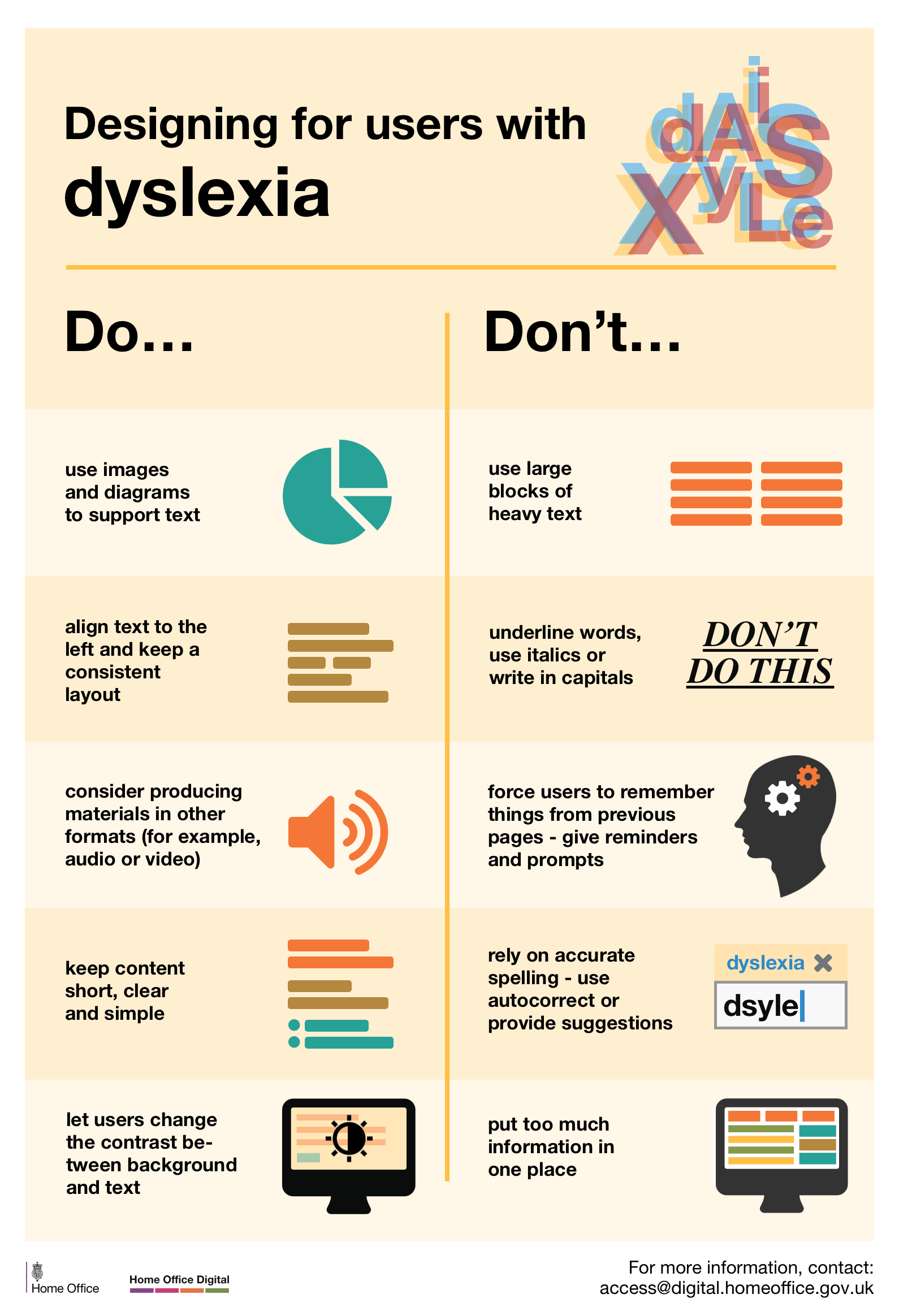
- 使用的图片或图表是否支持文本?
Have you used images and diagrams to support text? - 是否避免了使用大块文本并用子标题、列表、图片进行分隔?
Have you avoided using large blocks of text and broken it down into subheadinigs, bullets points and images? - 文本是否左对齐并与布局保持一致?是否慎用斜体、下划线?
Is the text left aligned and a consistent layout? Have Italics and underline workds have been been used sparingly? - 内容是否有产出了不同的格式,如音频或视频?
Has the content been produced in different formats such as audio or video? - 内容是否简短、清晰、简单?是否避免了在同一个地方出现太多的信息?这里提供可读性测试工具(The Readability Test Tool) www.webpagefx.com/tools/read-able/ 。
Is the content short, clear and simple? Avoided too much information in one place? The Readability Test Tool - 文本与背景之间是否存在高对比度(可识别性)?leaverou.github.io/contrast-ratio/
Have you provided high contrast between text and background? http://leaverou.github.io/contrast-ratio/ - 是否提供了大面积的可点区域,而不是要求用户追求点击精度?“运动残疾”(motor disabilities)
Have you make clickable items large and don’t demand precision? (motor diasbilities) - 所有快捷方式及快捷键是否定义且检查确保是可用状态,以及默认按钮是否也是正确可用的?
Are all shortcuts and shortcut keys defined and checked to ensure they work correctly as well as default buttons work correctly? - 所有音频是否有字幕或视频提供有文本信息?
Does all audio use subtitles or provide transcripts for video?
2、配色 Color
ColorDoes the site or page’s color scheme accurately convey the message or theme you want to associate with the product www.usertesting.com/blog/2014/12/02/color-ux-conversion-rates/
Are there any colors that distract from the message/theme?
3、内容 Content
- 联系方式与公司信息清晰可见。
Contact and company information is clearly displayed. - Important links are not places in moving features. EX. Auto-rotating carousels or accordions.
- 价格信息展示要清晰,没有隐藏的成本或一些意想不到的项目。
Prices are clearly displayed. There are no hidden costs or surprises in the terms. - Pop-ups 信息尽量避免除非到最后不得已才使用?
Pop-ups have been avoided and used as a last resort? - 隐私条款要清晰明确。
Privacy policy is clear - 按A~Z字母排序尽量避免,除非没有更好的排序替代方案时采用,诸如对描述相关性的项目进行分组。
Alphabetical. A-Z sorting is avoided. It is used only when there are no better alternatives, such as grouping items into descriptive related groups. - 文本是否清晰,用户无需通过放大阅读?是否使用Apple\Google所建议的字号大小?
Is the text legible for users to be able to read it with no zooming? Are you using recommended font sizes by Apple and Google? - 拼写及语法——显示在窗口、标题、错误信息、即时提示信息、状态条选项及气泡文本必须使用正确的拼写及语法。
Spelling and grammar – For elements like texts displayed in window, captions, error messages, field prompts, status bar options and pop-up text must be of correct spelling and grammar.
4、留白 Empty state
For an empty state page have you explained what content is going in that seciton, where the user is in the application or broader experience and what action or event that must occur for data to exsist on this screen
5、表单 Form
- 仅仅是绝对有必要的信息才要求用户提供。假如要求用户提供敏感类信息,你需要说明你为什么需要。
Only absolutely necessary questions are asked. If asking for sensitive information, you need to say why you need it. - 字段使用日常用语标注。(比如,姓名、地址等)
Fields are labeled with common terms. (i.e. Name, Address etc..) - 清晰的区分表单中的必填项与选填项。
Clearly distinguish between optional and required fields in the form - 字段标注因清晰的解释需要提供的信息。
Field labels on the forms should clearly explain what entries are desired - 文本输入框应该提供正确的长度。
Text boxes should be the correct length - 避免过长的下拉菜单。
Avoid long dropdown menus
6、图片 Images
图片、视频具有相关性且附有含义,没有冗余图片。 Images / Videos are relevant and meaningful. No stock photos.
7、目的性 Meaningful
- 落地页要提供明确的第一印象。
The landing page creates a positive first impression - 愉快地结束。通过目的性的结尾,我们确保用户愉悦离开,反馈幸福感,同时不断带回更多回报。
End on a happy note. By providing a means to an end, we ensure our users leave happy – reflect upon happiness – and keep coming back for more.
8、导航 Navigation
导航让用户知道当前所在位置。比如:面包屑,大型站点可用站点地图。
Users know where they are on the site. Ex. Breadcrumbs. Also there is a site map on large site.
9、授权 Permissions
是否明确你为什么向用户发问并会给用户带来什么?(用户应用授权的处理)
Have you made it clear why you are asking and what they user will get in return? www.youtube.com/watch?v=iZqDdvhTZj0
Nick Butcher explains Android’s runtime permission model and the right way to ask users for permissions. Android 6.0 introduced a brand new runtime permissions model where instead of asking for all permissions at install, app developers control when they’re requested. Picking the right way and time to ask for a permission then becomes critical to it being granted. This video outlines the best ways to ask for permissions in your app.
Runtime permissions let you build a more fluid app experience and enables a streamlined app install & upgrade flow. Understanding when and how to ask for a permission is critical to building better apps.
10、搜索 Search
- 搜索条容易被找到。Search bar is easy to find
- 搜索在每个页面都可用,而不仅仅是在主页。Search is available on every page, not just the homepage
- 搜索框内关联用户搜索建议。Inline text with suggestions of what users can search
技术评估 Tech Assessment
1、可进入性 Accessibility
- Have you build in for keyboard use only? All shortcuts and shortcut keys must be defined and should be checked to ensure they work correctly. Default buttons should also work correctly
- Have you described images using
<alt>and provide transcripts for videos? - 结构化内容是否HTML 5?
Have you used structured content using HTML5? - Are all shortcuts and shortcut keys defined and checked to ensure they work correctly as well as default buttons work correctly?
2、按钮及链接 Buttons / Links
- Do you provide visual feedback on buttons? Usually, a button isn’t a one-state object. It has multi-states, and providing visual feedback to users to indicate the current state should be a top priority task.
- There are no broken links. Check iwth W3 Link Checker
- Visited links color is different than unvisted
3、内容 Content
- 通知站点的变更,比如:配送条款修改 Changes to the site are announced. Ex. Changes in delivery policy.
- 音频不要自动播放 Audio does not start automatically
- Can the user easily verify that the information being provided by the online product is accurate and coming from a reputable source?
- 站点描述是否包含在浏览器窗口标题中,添加书签时容易理解?Is the site description in the window title, easily understandable as a bookmark?
- 站点网址是否容易被记住?Is the site’s url is memorable?
4、出错 Errors
是否提供了清晰简单的信息或错误提示让用户容易快速的返回正确的路径?
Do yoyu provide clear and simple messaging/ errors that allows the user to return to the correct path, quickly and easily?
5、表单 Form
- 产生错误时,鼠标指针应定位到问题发生的字段(输入框)。
When form errors occur, the cursor should move to the problem field. - 表单数据应该在用户提交前对输入的数据进行验证。
Data should be validated next to the field before the form is submitted - Your interface should be compatible with source documents when needed.
- 支持自动填充 Supports auto fill
- 字段输入能自动格式化数据。比如:用户输入日期0101,自动格式化显示为:2017-01-01
Fields should automatically enter formatted data. - Forms should use autofocus where appropriate
- 字段应包含默认值
Your fields should contain default values
6、图片 Images
Check through the entire application for broken images and fix them. Test the size of used and uploaded graphics and check all burners and respective sizes.
7、布局 Layout
- 站点为响应式布局,适配不同屏幕尺寸。
Site is responsive. Works with different screen sizes. - Images can be enlarged or zoomed in on for more detail
8、目的性 Meaningful
- 个性化特征(语言、货币、配送选项)要基于用户地理位置信息支持可变。
Personalized features. Language, currency, delivery options are changed based on the user’s location - 已登录用户名需要显示在站点。如:你好,Charles
Logged in user’s name is displayed on the site. Ex. “Hello Charles”
9、搜索 Search
- 当用户输入时自动完成。Auto complete as users type
- 是否提供了搜索引擎容易找到的内容,同时方便用户书签标记的内容?
How easy is it a) for search engines to find the content, and b) for users to bookmark it?
10、排版 Typography
从一个页面到另一页面或一个部分到另一部分是否整洁、易读、一致?
Is the typography from page to page and section to section clean, readable, and consistent?
图形评估 Graphics / Illustration
- Does it communicate what you’re trying to say?
- Does it accurately represent your project?
- Does it showcase the benefits of your project?
- Is it consistent with the other illustrations within arms reach?
- Is it designed for the constraints?
- Is this metaphor used somewhere else for a different concept?
- Could this be interpreted to mean something else?
- Is this empathetic to the emotional state of the user?
- What feelings does it evoke?
- Does it align with the brand values?
- Will it last as long as you intend to use it?
- Does it feel at home in context with the rest of the project?
资源列表(Source)
- A Good User Interface Checklist:www.goodui.org/
- W3C Accessibility:www.w3.org/TR/WCAG10/full-checklist.html
- IxD Checklist:ixdchecklist.com/
- 10 Usability Heuristics for User Interface Design:www.nngroup.com/articles/ten-usability-heuristics/
- 52 Question Checklist for Responsive Web Design Projects (with PDF):bonfx.com/52-question-checklist-for-responsive-web-design-projects-with-pdf/
- Designer’s Toolkit: Road Testing Prototype Tools:www.cooper.com/journal/2013/07/designers-toolkit-proto-testing-for-prototypes
- Complete Beginner’s Guide to Universal Design:www.uxbooth.com/articles/complete-beginners-guide-to-universal-design/
- How to Design for Color Blindness:blog.usabilla.com/how-to-design-for-color-blindness/
- Empathy prompts:empathyprompts.net/#hearing-loss
可进入性参考(Accessibility)
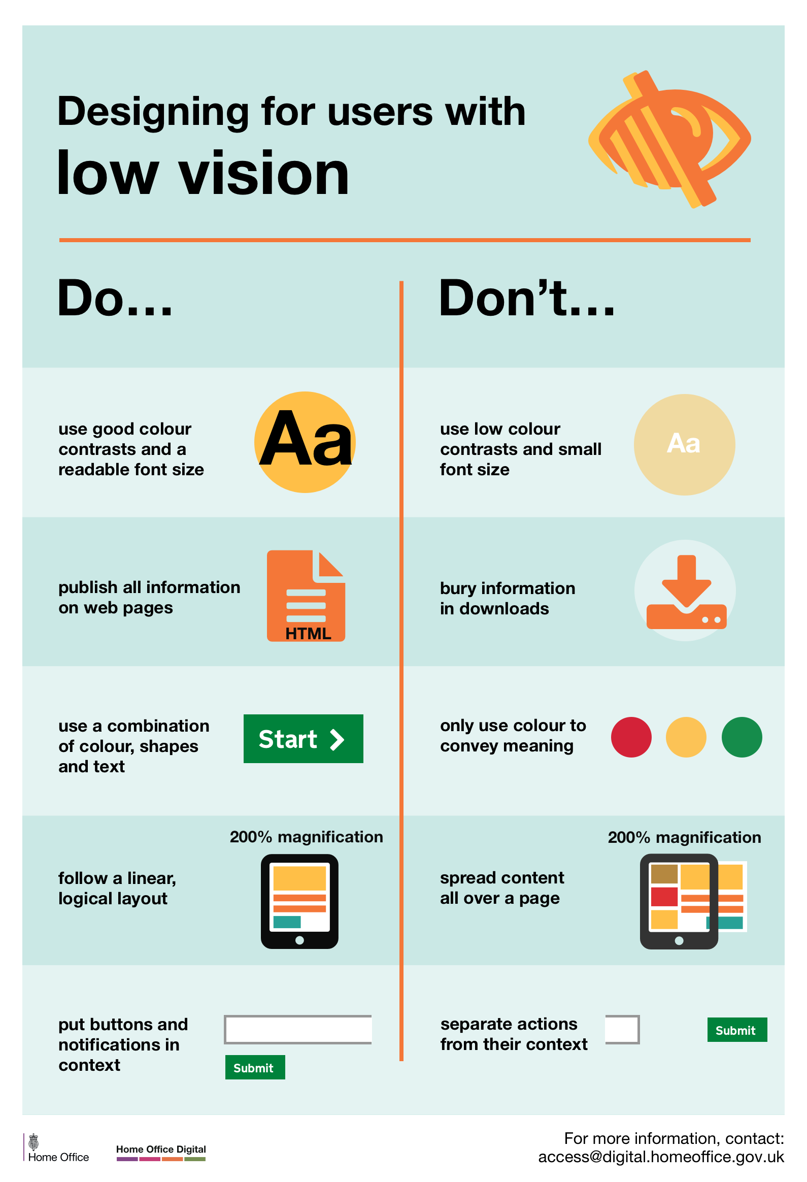
- Design for users with low vision:accessibility.blog.gov.uk/wp-content/uploads/sites/52/2016/09/visually-impaired-low-vision.png
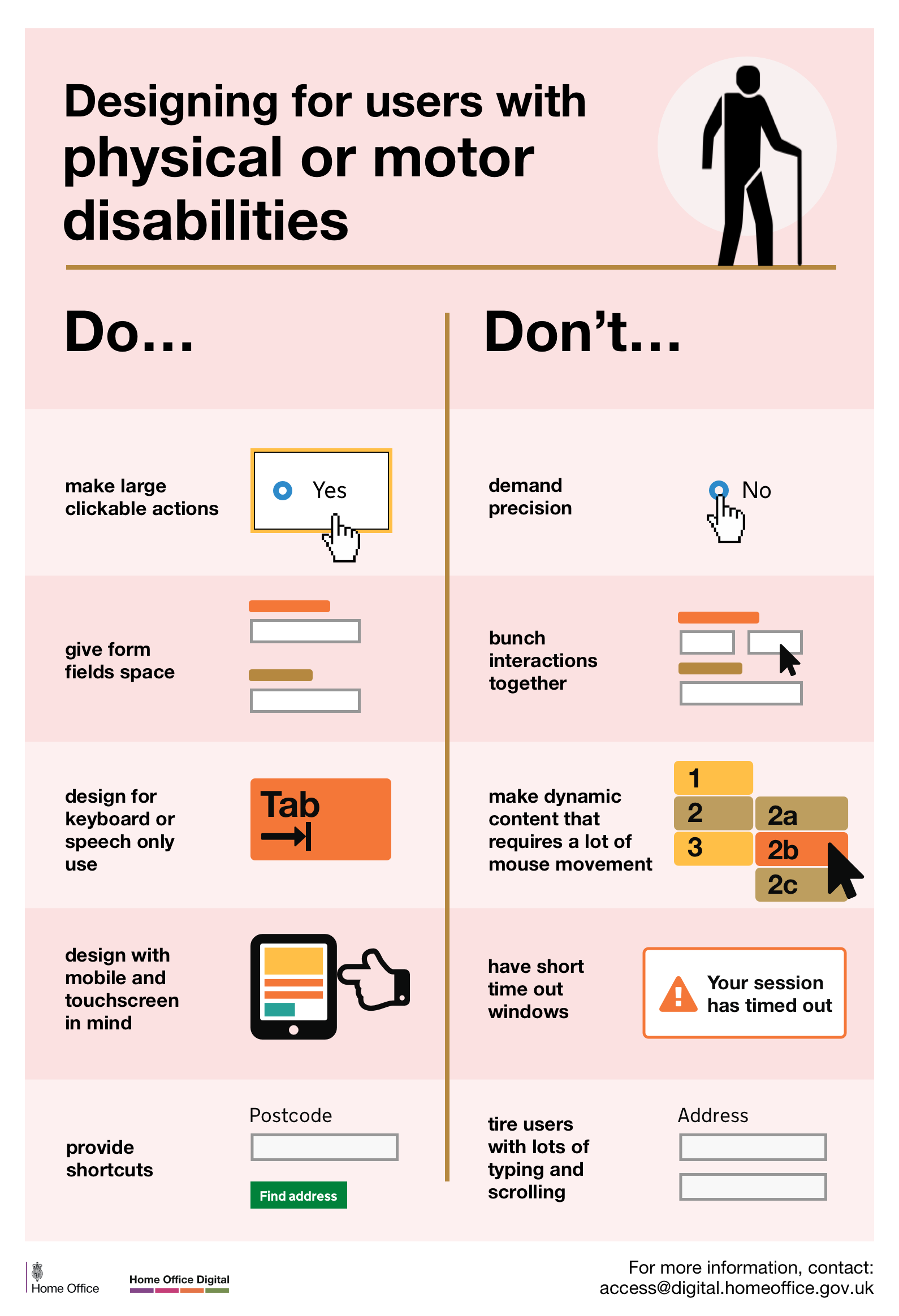
- Design for users with physical or motor disabilities:accessibility.blog.gov.uk/wp-content/uploads/sites/52/2016/09/mobility-issues.png
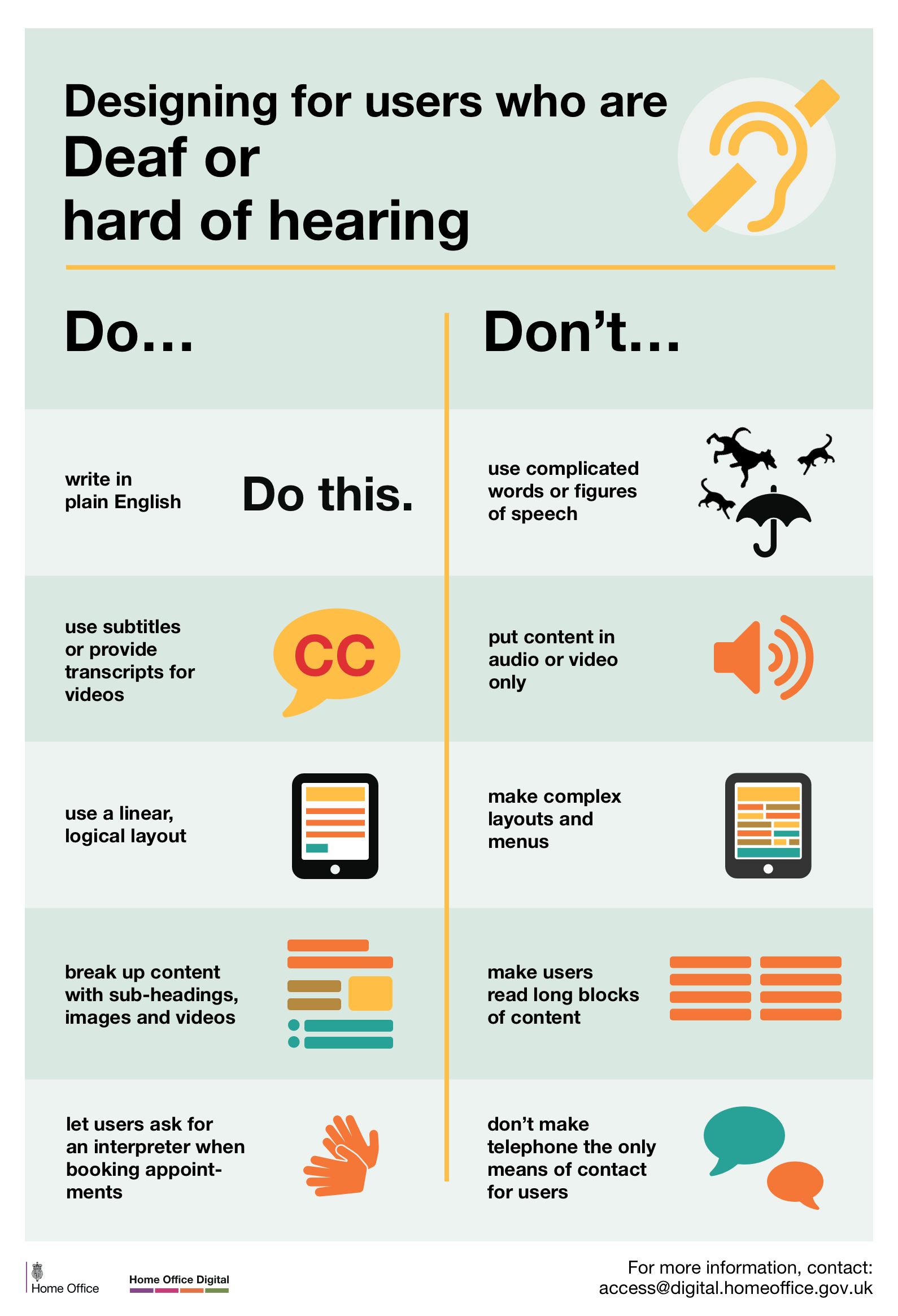
- Design for users who are D/deaf or hard of hearing:accessibility.blog.gov.uk/wp-content/uploads/sites/52/2016/09/deaf-and-hard-of-hearing.png
- Design for users with dyslexia:accessibility.blog.gov.uk/wp-content/uploads/sites/52/2016/09/dyslexia.png
via: drive.google.com/drive/folders/0B5mO61GsMc8hNTRUWkppeXhvZVk