用户体验提升:表单设计方法总结(Form Design)
表单是用户人机交互的重要窗口,一个好的表单使用体验对于提升工作效率及用户主观体验都是非常有意义的。通常来讲不管是移动APP产品,还是WEB引用,表单的设计在用户体验提升中都扮演举足轻重的作用。以下通过案例+方法论来说明表单设计优化方法。
基础方法
单列布局
眼动研究及A/B测试表明,表单采用单列布局的效果相对于多列布局更好。
This has been well researched in eye-tracking studies (including our own), and business case studies and A/B tests. When you’re deciding between a single column form and a multi-column, default towards the single column.
source: conversionxl.com/blog/form-design-best-practices/
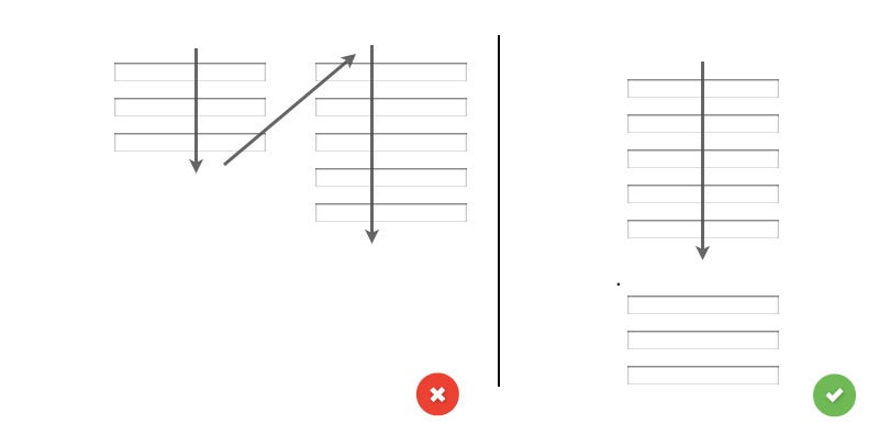
image source:uxplanet.org/designing-more-efficient-forms-structure-inputs-labels-and-actions-e3a47007114f
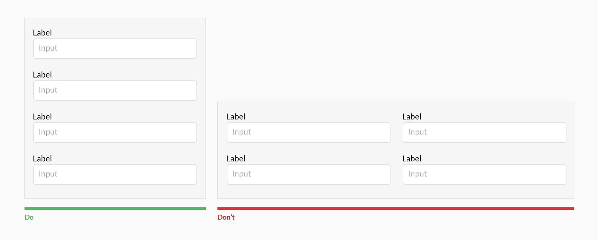
多列布局容易打断用户的正向操作
image source: uxdesign.cc/design-better-forms-96fadca0f49c
顶部对齐
表单中的标签与输入框应采用顶部对齐,提升操作效率。
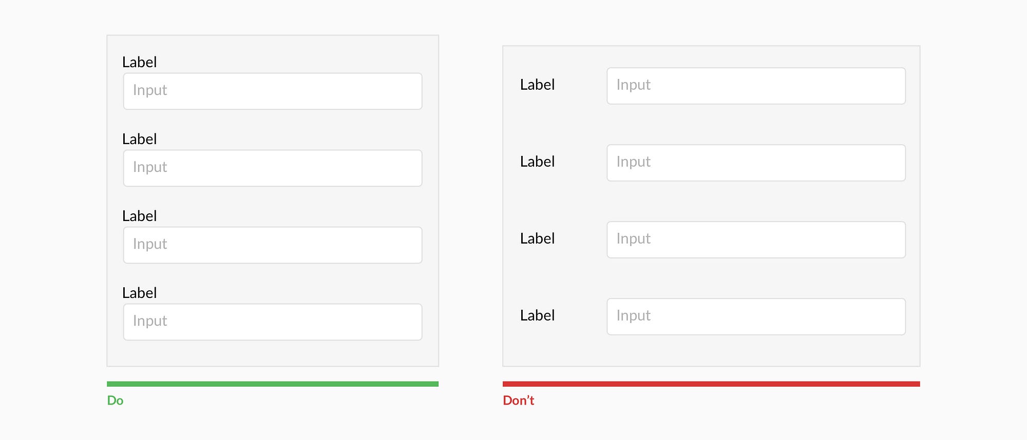
用户在采用标签与输入框上下对齐的表单布局相对于横向布局中完成操作会更加高效。另外这种标签与输入框上下对齐的布局方式也更好的能应用在移动APP产品上。当然,也有横向的对齐布局方式对于大数据来说会更好(降低了页面高度,方便数据扫描高效)。
Users complete top aligned labeled forms at a much higher rate than left aligned labels. Top aligned labels also translate well on mobile. However, consider using left aligned labels for large data-set entry with variable optionality because they are easier to scan together, they reduce height, and prompt more consideration than top aligned labels.
间距控制
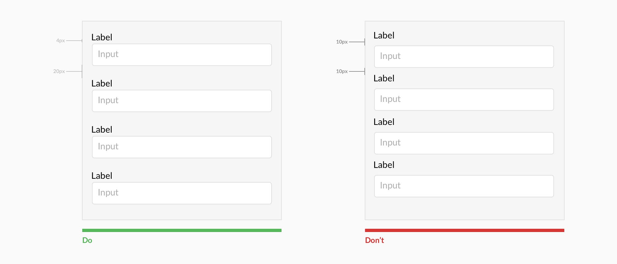
让对应的标签与输入框布局间隔靠近,同时确保不同组合的字段保持足够的距离,以免引起用户操作困惑。
Present the label and input close together, and make sure there is enough height between the fields so users don’t get confused.
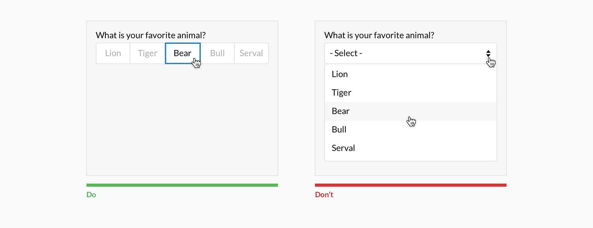
可选项全部展示
单选/复选按钮选项,或下拉选项操作中,当 *数量少于6个时则全部展示*。