5 Signs of a Great User Experience 20120417
5项卓越用户体验特征
 If you’ve used the mobile social network Path recently, it’s likely that you enjoyed the experience. Path has a sophisticated design, yet it’s easy to use. It sports an attractive red color scheme and the navigation is smooth as silk. It’s a social app and finding friends is easy thanks to Path’s suggestions and its connection to Facebook.
假如你使用过移动社交网络 Path (一款移动产品), 它应该给你带来了很帮的用户体验。Path设计很复杂,使用起来却很容易。 很具吸引力的红色以及平滑的如同丝带一样的导航。她是一款社会化应用可以通过Path的建议和Facebook的连接很轻松的找到朋友。
In short, Path has a great user experience. That isn’t the deciding factor on whether a tech product takes off. Ultimately it comes down to how many people use it and that’s particularly important for a social app like Path. Indeed it’s where Path may yet fail, but the point is they have given themselves a chance by creating a great user experience. In this post, we outline 5 signs that the tech product or app you’re using has a great UX – and therefore has a shot at being the Next Big Thing.
简单来说,Path有非常好的用户体验。
1. Elegant UI 优美的UI设计
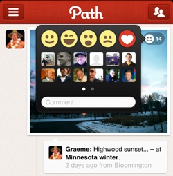
 A great user experience isn’t just about the user interface, but it helps a lot. While I’m not a regular Path user, today I opened it up and browsed for a bit. To like an item on Path, you click a little smiley icon in the top right. If you really, really like an item, you can make it a heart icon. There are three other options: a winky face, a surprised face and a sad face. So Path has cleverly created 5 different types of ‘like’ using subtle but obvious icons. This is something that Facebook hasn’t yet cracked; it only has one style of ‘like’ and many people have argued for a ‘dislike’ option, at the very least.
好的用户体验不仅仅在于用户界面,当然它的作用也不不小。
2. Addictive 让用户上瘾
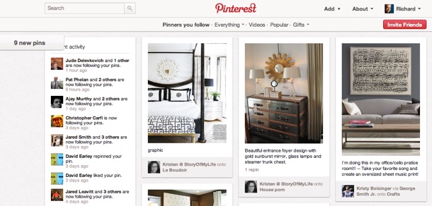
A nice design is one thing, but you also need to see value in it. It must either solve a problem for you, or be a pleasurable distraction. Time and time again. In other words, it must be addictive. One of the current trendy services on the Web is Pinterest, an online pinboard that has become an addiction for many. In a text-heavy social Web, Pinterest has nailed the concept of a completely visual user experience. It solves a problem, because it gives you a place to store images around topics – such as the very popular wedding dresses section. It brings you back every day, if you get hooked.

3. Fast Start 让用户快速上手
The Kindle Fire as a product is not as aesthetically pleasing as the iPad 2. The Fire is rectangular and small, looking a bit like the iPad’s runty little brother. But what the Kindle Fire does better than the iPad is get the user started – and hooked – straight out of the box. With the iPad, you need to connect to iTunes or manually set up your account to get things started, which can often be a time consuming and awkward experience for newbies. But if you buy the Kindle Fire from Amazon, it comes pre-loaded with your Amazon profile. This enables most users to start downloading content as soon as they switch the device on for the first time.
Note that the rest of the Kindle Fire’s user experience is not always pleasurable. But the start up is one part that is.
4. Seamless 无缝对接
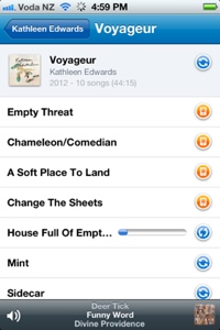
 With so many Internet-connected devices and screens nowadays, it’s important to have a consistent experience. One recent example of this for me is the online music app Rdio. It only just became available in my country, but I was immediately impressed by the consistent user interface between Rdio’s iPhone app and the desktop app on my computer. Rdio takes that seamlessness a step further though, in allowing you to download whole albums onto your mobile device so that you can listen to them offline. It would’ve been easy for Rdio to get that functionality wrong, for example by enabling download on 3G and giving you a huge cellphone bill. But by default, Rdio only downloads songs onto your mobile phone using WiFi (you can turn on 3G download if you think you can afford it). It’s the little details like that which make a great user experience.
5. It Changes You 可以改变用户
Arguably the most outstanding tech products are ones that revolutionize the way we do things. The iPhone and iPad are two high profile examples from recent years. Twitter is another. These are products that create a brand new user experience, or change old habits in a good way.
When I asked for examples of a great user experience over on Google+, Chris Brogan commented that FitBit has changed the way he manages his fitness. “The information it gathers is useful,” said Chris, “plus the way it’s displayed to me challenges me to do more with it.”
Having an overall great user experience is difficult to pull off. Some of the products mentioned above only get part of it right, for example Kindle Fire and Path. I even said that the iPad, an otherwise glorious product, is slightly disappointing in the start up.
What products or apps have given you a great user experience recently? We’d love to hear about what’s making you happy.
via: 查看原文
翻译: 涉水轻舟