
响应式图片 设计方案
In my post “Where are the Mobile First Responsive Web Designs” , I noted that one of the first things I look for when trying to determine whether or not a responsive web design is “mobile first” is whether or not it has a strategy for handling the IMG tag.
A recent Smashing Magazine round up of responsive web design techniques included several new approaches for handling IMG tags which makes it the perfect time to dig into this problem and the potential solutions in more depth.
Why IMG Tags Suck for Responsive Web Design
If you want your site to load as quickly as possible, you do not want to deliver larger files than are needed. Many responsive web design sites provide mobile devices images at sizes appropriate for desktop and ask the mobile device to resize the image.
In my research, I found nearly 80% decrease in file size by delivering images at the actual size they were going to be used on a mobile device.
So what’s the problem with the IMG element in responsive designs? Unlike CSS images which can provide different source files based on screen resolution using media queries, IMGs have a single source attribute.
What are Responsive IMGs?
Responsive IMGs are images delivered using the HTML IMG tag that come from different sources depending the screen size. There are many different techniques for accomplishing Responsive IMGs.
As far as I can tell, Scott Jehl first coined the phrase Responsive Images to describe a javascript solution to the img source problem. He also referred to Responsive IMGs as a general term recently so I’m hopeful he doesn’t mind the fact that I’m extending his definition to describe any technique that attempts to provide images at an appropriate size for a responsive design.
Responsive IMGs Challenges
There are some common challenges that any Responsive IMG technique will face. As we review the various techniques that have been proposed, we need to keep these challenges in mind.
Minimum Bar: Start with Mobile, No Extra Downloads
Scott Jehl set a minimum bar for Responsive IMGs by stating they must do the following:
- Start with mobile img
- Upgrade to larger size without downloading both
Both of these are worthy and necessary goals.
The First Page Load Problem
Any solution that relies on client-side scripting to make a decision about what image source to display will suffer from a first page load problem. The first time someone visits a site, the server won’t know what size image to provide.
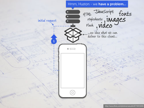
Image from Bryan Rieger’s Muddling Through the Mobile Web presentation, photo by wscullin, licensed under Creative Commons.
If javascript is added that determines what image size is appropriate, then this information can be retained for the user session via cookies or similar techniques. In theory, on subsequent requests the server can make a decision about what size image to include in IMG tag.
FWIW, the speed of first load is a big deal. The speed of a person’s first experience can dictate their impression of a product and company. Google, Yahoo and others have talked about how minor speed differences makes a big difference in usage of their products.
Rendering Race Conditions
Techniques that rely on adjusting the image source attribute via javascript need to make sure that the modification happens before the image requests start.
Browser makers have done a lot of work to download as many assets as possible at the same time. Usually this is a good thing. But in the case of responsive imgs, the javascript needs to evaluate what size image to retrieve before any image requests start.
A lot of earlier work was done using dynamic base tags. This worked when the javascript was inline in the head tag, but failed to prevent images from downloading twice when an external javascript file is used.
The upshot is that nearly every client side technique requires deep understanding of the order in which different browsers process and download assets. Or more realistically, each approach needs to be tested extensively.
Content Delivery Networks and Caching
When you deliver different size images at the same url, you can run into problems with CDNs and other caching at the edge of the network. If the first person to request an image is on a mobile phone, people who follow via the same CDN or cache will also see the mobile-optimized image even if they are on desktop unless consider CDNs in your strategy.
Future Friendly Responsive IMGs
If we accept that the “quantity and diversity of connected devices—many of which we haven’t imagined yet—will explode”, then we need to consider look for solutions that are future friendly . In addition to the current experimentation, we need to start thinking about what a long term solution might look like.
For example, many of the early solutions for Responsive IMGs consist of two size images: one for desktop and one for mobile screen sizes. Will two image sizes really suffice for all of the devices that are coming?
Also, a lot of the solutions right now tackle one part of the problem. They may tackle the client side changes to switch the image source, but leave as an exercise for the developer to figure out how image resizing will be handled. For shared libraries, limited scope makes sense.
But as we look at what systems will need to do to be successful in the future, we need to think about what we want out of both the server and client side.
Here are some of the things that I think a future friendly technique will need to consider:
- Support arbitrary image resizing — We cannot anticipate what screen sizes may be coming. We need systems that handle image resizing automatically and support any arbitrary size needed for a particular page.
- Art direction can override automatic resizing — Not every image can be resized without losing the meaning of the image. Sometimes cropping an image may work better than resizing it. Automatic tools need to easily support manual override.

- Support for higher resolution displays — What do we do with the iPhone 4’s retina display and other devices sharing similar high resolution screens? It is an open question about whether we should deliver higher resolution images to those devices given the performance hit that will occur if the person is on a slow connection.
But regardless of how we chose to handle it right now, it is clear that the trend towards more pixels per inch on displays is not going away. If anything, we’re seeing indicators that higher density will soon be available on desktop displays as well.
This means that our current definition of what is a large image for web is probably too small for future devices. With that in mind, it probably makes sense for systems to accept the highest resolution image possible—even if that resolution isn’t currently being used—so that when new devices become available the high resolution source is already available and hasn’t been lost.
- Connection speed should be part of the criteria — We can be much smarter about the size of the image we deliver if we can tell something about the network connection. We need an easier way to get at this information.
- A replacement for the IMG tag? — All of the responsive image solutions are attempting to deal with the fact that the image tag has only a single source. There have been various proposals recently to take a new look at what the tag should be and see if we can find a long term replacement.
That’s my short list. What would you add?
In part 2, I’ll take a closer look at the current alternatives for responsive imgs and which ones hold the most promise.
via: http://blog.cloudfour.com/responsive-imgs-part-2/ (文/Jason Grigsby)
In Responsive IMGs Part 1, I took a high-level look at what responsive IMGs are, the problem they are trying to solve, and the common issues they face. In this post, I’m going to take a deeper look at the specific techniques being used to provide responsive IMGs and try to evaluate what works and doesn’t. If you haven’t read part 1, you may want to do so before reading this post as it will help explain some of the terms I use.
When I started working on this project two months ago, I thought I would get to the end and be able to say, “Here are the three approaches that work best. Go download them and figure out how to integrate them into your systems.” Oh naivety!
What I’ve found is that there is no comprehensive solution. Instead, we have several months of experiments. Each experiment has its own advantages and disadvantages.
Because of this, the best thing we can do is understand the common elements and challenges so that we can start to pick the best parts of each for building our own solutions.
So um… this is a long post. Sorry. :-)
Abandoned approaches
Dynamic Base Tag
Many of the early techniques used javascript to dynamically change the base tag. The new base tag would add directories into the path that would be used to indicate what size image should be retrieved. After the document loaded, the base tag would be removed.
Many of the early techniques used javascript to dynamically change the base tag. The new base tag would add directories into the path that would be used to indicate what size image should be retrieved. After the document loaded, the base tag would be removed.
Unfortunately, this approach ran into race conditions that I described in part 1. I found that Google Chrome was downloading both the mobile and desktop images. Scott Jehl found the problem to be a difference between how inline and external javascript is handled. He submitted a bug to webkit which has been marked as “won’t fix” because:
Inserting base element effectively changes all the subsequent URLs on the page. Any script may insert one so to avoid double loads we could never load anything else as long as there is a pending script load. This would mean disabling preloading, which is out of the question.
In theory, you could still use a dynamic base tag inline, but the Filament Group has been primarily using a cookies-based approach instead which seems safer.
Temporary images
Another early technique was to have the src of imgs pointing to a temporary image and then having javascript replace the source with the correct file path. In most cases, the image was an one pixel transparent gif set up with caching which would hopefully prevent the browser from requesting it more than once no matter how many times it was referenced in the page.
The problem with this technique is that if javascript isn’t present, the browser will never download the images.
Javascript-based solutions
Where do you store the path to alternate versions of an image?
If the the img points to ‘small.jpg’, where do you put the information that ‘large.jpg’ is what should be loaded on larger screens?
URL parameters
One solution is to put the path to alternate versions of the image in the src attribute as url parameters. In its simplest form:
<img src="small.jpg?full=large.jpg">
If you have multiple sizes of images, they simply get added as additional values on the url. The key to making this work is coupling it with an .htaccess file.
POTENTIAL CDN, PROXIES, AND CACHING ISSUES
The big drawback to using URL parameters is that it may cause problems with content deliver networks and proxies that doesn’t pay attention to url parameters when caching content. Some caching algorithms ignore anything that has a URL parameter on it which means that pages will slow down because images aren’t cached.
Others will simply cache the first version of the image they see. If the first person behind a proxy cache happened to view the page on a mobile phone, then every subsequent user sees the mobile size image until the cache expires.
How likely is this to be an issue? I had the same question so I asked Steve Souders. He says that it is enough of a problem that you can’t ignore it. This echoes comments by Bryan and Stephanie Rieger at Breaking Development about problems with caching and CDNs.
Therefore, I think we should be looking for techniques that don’t use url parameters.
EXAMPLES OF THIS APPROACH:
- Responsive Images JS Master Branch
- Responsive images alt
- Responsive Images and Context Aware Sizing
- Responsive images with Doubletake.js
- Responsive images with PHP and jQuery
- Responsive images using cookies
- Context aware responsive images
Data attributes
Instead of putting the file path into the url parameters, the information is put in one or more data- attributes. For example:
<img src=”small.r.jpg” data-fullsrc=”large.jpg”>
Which element has data attributes added to it and how many are added depends on the technique.
LOOPING THROUGH EVERY IMG TAG
The only disadvantage to this technique that I’m aware of is the fact that the javascript has to loop through every image, check for data attributes, and then modify the src attribute depending on screen size. This is probably not a big problem on desktop browsers which is where the loop is mostly to be used.
EXAMPLES OF THIS APPROACH
- Responsive Images JS data-attribute-based branch
- Testing Responsive Images
- Creating responsive images using the noscript tag
Assumed file structure
In this variation, the file path isn’t included in the HTML document. Instead, it is assumed that the images are put on the server in a regular fashion. For example, all small images might be in /images/sml/ whereas large images are in /images/lrg/.
If this is true, then the html doesn’t need to provide both paths. It just needs to provide the image filename (e.g., boat.jpg) and then let javascript modify the src to be appropriate for the size of the screen (/images/lrg/boat.jpg for desktop).
EXAMPLES OF THIS APPROACH
responsive-images-alt
Adapative images
Dynamic file names
One of the things that I suggested in part 1 was that we might need arbitrary image sizes. Some of the solutions are built around the assumption that you can pass the dimensions that you want in the url and get back an image at that size.
Because the images are resized on the fly, there is no need to store alternative file paths in the HTML document. Javascript will modify the filename from something like ‘boat.jpg’ to ‘boat-480×200.jpg’. There is no issue with caching or CDNs because each image is unique.
SOME IMAGES CANNOT SIMPLY BE RESIZED
This approach doesn’t provide a good solution for manually choosing images at different sizes. It assumes that resizing images will work in all cases which we know is not true.
EXAMPLES OF THIS APPROACH
Role of .htaccess (or similar rewrite rules)
Many of the solutions rely on server rewrite rules. The examples are usually written using Apache .htaccess files, but they could be any sort of rewrite rule.
Lets look at a snippet of the .htaccess file from Responsive Images JS cookie-based branch to see how rewrite rules are being used:
RewriteEngine On
#large cookie, large image
RewriteCond %{HTTP_COOKIE} rwd-screensize=large
RewriteCond %{QUERY_STRING} large=([^&]+)
RewriteRule .* %1 [L]
The first line turns rewrite rules on. Next comes a couple of conditions (RewriteCond). The first checks to see if there is a cookie called rwd-screensize that has the value of large. The second checks to see if the query string for the url contains a value for large. This .htaccess file is looking for something like:
<img src="small.jpg?large=large.jpg">
If both conditions are met—the cookie is set to large and there is a large value in the query string—then the rewrite rule will send the file that was specified in the query string (in the example above, that would be large.jpg).
The rwd-screensize cookie is set by javascript after it tests for the screen size.
How do you prevent the browser from downloading multiple images?
With the basics out of the way, we can now get to the tricky part. As mentioned in part 1, intercepting the browser before it starts downloading images so that you can evaluate and possibly change the source of those images is tricky and may result in race conditions.
Now that the dynamic base tag has been ruled out, there are two main techniques that remain.
Set a cookie
This is the method that the Filament Group settled on for the Boston Globe. Javascript is inserted into the head of the document so that it evaluates as soon as possible.
After it determines the screen size, it sets a cookie. Every subsequent image request sent from the browser will include the cookie. The server can use the cookie to determine the best image to sent back to the user.
POTENTIAL PROBLEMS
If the browser doesn’t support cookies or the user blocks them, then the javascript will have no effect.
Also, Yoav Weiss has done some testing and shared results that indicate that duplicate files will be downloaded by IE9. Firefox will download duplicate files if the script is external, but not if it internal. This suggests that cookies may also be subject to the race condition problem that caused us to abandon the dynamic base tag approach.
EXAMPLES OF THIS APPROACH
Noscript tag
Within the last couple of months, new techniques have emerged that use the noscript tag as a way to prevent extra downloads. The first post I saw describing this technique was by Mairead Buchan. She describe it as having “ the elegance of a wading hippo”. Despite that description, I think this technique holds promise.
A cleaner implementation of the noscript approach was created independently by Antti Peisa. Here is the html:
<noscript data-large='Koala.jpg' data-small='Koala-small.jpg' data-alt='Koala'>
<img src='Koala.jpg' alt='Koala' />
</noscript>
The values for the various sizes of image tags are stored in the data attributes on the noscript tag itself. Antti then provides sample jQuery code used to process the image:
$('noscript[data-large][data-small]').each(function(){
    var src = screen.width >= 500 ? $(this).data('large') : $(this).data('small');
    $('<img src="' + src + '" alt="' + $(this).data('alt') + '" />').insertAfter($(this));
});
These lines go through the document to find noscript tags with the appropriate data attributes. It tests for the screen size and then inserts a new img tag with the appropriate image path and alt tag.
NO RACE CONDITIONS!
When using the noscript tag, there are no rendering race conditions. The image in the noscript tag never starts downloading. Mairead explained that “ it works because children of the [noscript] tag are not added to the DOM ”.
This makes sense. The browser knows if javascript is available before it starts rendering a page. If javascript is available, there is no reason to worry about doing anything with items inside the noscript tag. If they aren’t getting added to the DOM, they certainly aren’t going to get downloaded.
This technique also has fallbacks if javascript isn’t enabled and doesn’t rely on cookies or htaccess files.
POTENTIAL GOTCHAS
The biggest gotcha will be devices that profess to support javascript, but have poor implementations. For example, Blackberry 4.5 has javascript, but javascript cannot manipulate the DOM. Ergo, the noscript tag will not get used because scripts are available, but the script won’t successfully add a new img tag so no images will show.
Please note, this is speculation on my part. I know how Blackberry 4.5 behaves, but I haven’t tested this particular approach on a 4.5 device.
Even though this approach does not create a race condition, it is important that the javascript execute as quickly as possible. Inserting all of these images may require the browser to reflow the page. It also may cause the browser to load assets less efficiently because it cannot start prefetching assets.
Because of the need to execute as quickly as possible, it makes sense to remove the jQuery dependency from Antti’s javascript and put the code in the head of the document.
EXAMPLES OF THIS APPROACH
- “Creating responsive images using the noscript tag
- Testing Responsive Images
- Responsive context aware images without cookies or server logic
Is screen size the right thing to look at?
Most of these techniques rely on the size of the screen to determine what the image size should be. Andy Hume points out that the size of the screen may be misleading. He writes:
The content driven approach to fixing this is to decide which image to load based on whether the image will be stretched beyond its true pixel width. If you stretch an image beyond its true width it begins to look pixelated or blurry. In this scenario, we want to load in a higher resolution version of the image.
Andy’s fork of the Responsive Images JS tackles this problem (and adds support for nginx).
Boston Globe Responsive IMGs are Busted
I’ve been looking forward to the Boston Globe’s launch for quite some time. It is a tremendous feat of engineering and design. It has the volume of traffic necessary to test different approaches to responsive IMGs and see what works and what doesn’t.
The technique that they chose to use combines data attributes with cookies. Unfortunately, responsive IMGs are currently broken on the Boston Globe site. This is a known problem and they are working on fixing it.
The upshot is that we don’t yet have a large scale deployment of any of these techniques that we can interrogate and point to as validation that a particular combination is battle-hardened.
Most promising javascript only techniques
In my mind, cookies plus data-src and noscript are the two most promising techniques. Both have problems, but they have far fewer gotchas than other approaches.
Server side solutions
Most of the javascript techniques require little, if any, support from the server. There are alternate approaches that leverage the server for a bunch of the heavy lifting.
User agent string parsing
A few people have demonstrated solutions that do light-weight user agent string parsing to identify various mobile phones. If the user agent can be identified as iPhone or Android, then declare the device mobile and set the image size appropriately.
Unlike a lot of developers, I don’t have a problem with device detection based on user agent string. But if you’re going to start doing it for mobile, you have to take on real device detection via WURFL, Device Atlas, etc. Simplistic regular expression matching and assumptions about screen sizes isn’t going to work.
Device detection
There are a couple of different approaches that rely on device detection to determine the screen size and deliver an appropriate image back. Device detection databases are pretty good about having basic information like screen size.
Sencha.io Src (formerly called TinySRC)
James Pearce created a fantastic service called TinySRC. He later went to work for Sencha and TinySRC became Sencha.io Src. Sencha.io Src automatically resizes images for you. You reference Sencha.io Src in your img stag like this:
http://src.sencha.io/http://www.myapp.com/myimg.jpg
When a browser requests the url above, Sencha.io Src will look up the user agent of the device making the request to determine what size image is appropriate. It will then grab the image from your server and resize it. It then caches the resized image so that subsequent requests can be served quickly.
In addition to the automatic mode, Sencha.io Src will also allow you to specify specific sizes that you would like the image resized to.
COMBINING RESPONSIVE IMAGES JS WITH SENCHA.IO SRC
Andrea Trasatti forked Scott Jehl’s Responsive Images JS to combine responsive IMGs with TinySRC . The script finds the screen size using javascript and then uses htaccess to request the image at the correct size from Sencha.io Src.
Andrea’s version was written fairly early. It still uses dynamic base tags, url parameters, and results in “1 HTTP request for every image that we might avoid”. But all of these problems could be remedied by combining what Andrea started with some of the newer approaches.
POTENTIAL DRAWBACKS
First, if you have a religious aversion to device detection, then you probably don’t want to use Sencha.io Src or you need to use it in a scenario where can specify the image size that you want.
As an aside, I’ve found it funny to see people who speak ill of device detection and user agent strings suggest that people use TinySRC. I once saw a slide deck that dismissed device detection and then a couple of slides later talked about how great TinySRC is. If only they knew. :-)
On a more practical level, you have to evaluate whether or not the service will remain up and what happens if all of your content points to sencha urls that suddenly go away. I don’t think Sencha is going to go anywhere anytime soon. I know James well enough to know he’ll want to keep this service running forever if he can. But even all that said, looking at the long term availability of a service is something that needs to be considered.
WURFL-based solution
WURFL is the largest open source device database. After attending the Breaking Development conference earlier this month, Carson McDonald was inspired to develop a WURFL-based solution for images. It’s awesome to see something come together so quickly after the conference.
(BTW, Breaking Development is the best conference in North America for web on mobile. Registration for the next event opens today. You should attend!)
Carson notes that his approach will likely have the same problems with CDNs and caching because different size images come from the same url.
Image resizing services
Google’s mod_pagespeed
Google’s mod_pagespeed Apache module automates many performance tasks and includes an option to scale any images on the fly. There are many ways to scale images (GD, ImageMagick, etc.). I decided to call out mod_pagespeed because it was one I hadn’t considered until I saw it suggested in a forum. I don’t know of anyone who has explored how it might be used in an responsive IMGs solutions.
Combining client and server approaches
Adaptive Images
As you can probably tell by now, there are few solutions that you can simply install and forgot about. Most require at minimum changes to the way you mark up the page. The two solutions that come closest to be plug and play are Sencha.io Src and Adaptive-Images.com .
Adaptive images was developed by Matt Wilcox. It turns the premise of Responsive IMGs on its head by assuming that the markup on the page will contain the large versions of images and will not start with the mobile versions.
The solution consists of three pieces:
1. A small snippet of javascript placed in the head that sets a cookie with the screen width and height.
<script>document.cookie='resolution='+Math.max(screen.width,screen.height)+'; path=/';</script>
2. A .htaccess that rewrites all requests for images to a php file. You declare directories that you want to exempt from this rewrite. For example, you don’t want your media query savvy CSS background images getting routed through the php file.
3. The php file which resizes the image based on breakpoints that you can configure.
The best part of Matt’s solution is that as long as you can separate out your image files so you can exclude ones that shouldn’t be resized, you can implement this technique without making any changes to your existing markup. Existing pages and posts will suddenly have different image sizes.
AND NOW FOR THE PROBLEMS
Come on, by now you weren’t expecting it to be that simple did you?
Because the images start with the large size, if javascript is not available, the large size will be—delivered. The most common devices to not have javascript support are older feature phones. The -type of devices that will choke and even crash on large images are older feature phones.
This technique also suffers from the same race conditions that most of the javascript solutions do. The cookie has to be set early to avoid extra downloads.
Update: Matt commented below and points out that the default settings will result in a small image being delivered if javascript isn’t present. The markup will point to a large version, but the php file returns a small version. All of this is configurable.
Also, he is right that the result of the race condition would not be multiple downloads. I think the race condition still exists with different drawbacks, but I’m going continue the conversation in the comments where Matt and I can converse.
I also missed the fact that the url will stay the same regardless of the size of image which can cause issues with CDNs and proxy caching as noted earlier.
h4.Yiibu profile approach
Brian and Stephanie Rieger presented the work they did for browser.nokia.com at Breaking Development conference. For that project, they invented a new way to combine client side information with device detection.
When a browser first requests something from the server, they don’t know anything about the device. So they check with a device detection database to see what they can find out about the size of the screen (and other details). They then check their own local database of tacit knowledge. This a database of things they’ve learned about how specific browsers work and any overrides they want to use. They use the combination of this information to deliver the appropriate HTML, javascript and images.
Once the browser gets this information, a javascript runs that tests the various aspects of the browser including screen size. It then stores this information in a profile cookie.
On the second request, the server receives the profile cookie and compares it to the information it has in its tacit database. It may update the tacit database. It combines the information into a revised profile combining server side information with client feature detection data.
I’m likely doing a poor job of describing the solution. Your best bet is to look at their slides:
This combined technique mitigates the problem of first load without any of the race conditions or potential problems that the client-only solutions have. It also extends beyond images to other content and javascript.
SOUNDS GREAT. WHAT’S THE CATCH?
It is a complex system and requires significant changes to infrastructure to support. Bryan and Stephanie have published the approach, but the code isn’t available for download. It may be coming, but they took a well-deserved vacation after spending most of the summer working on the Nokia Browser project.
Probably the biggest problem with this approach is that most of us are not the Riegers. They have been doing mobile web for years. Their tacit knowledge of devices is exceptional. Freaking geniuses. That’s hard to replicate.
The same is true of the Boston Globe project. The team working on that included significant portions of the jQuery Mobile team and the guy who coined the phrase responsive web design. Few of us are going to be so lucky on our next project. :-)
Summary
As I’ve reviewed the various techniques, I keep thinking back to something Andy Hume said in response to part 1:
Our current solutions are hugely dependant on the current (and undefined) behaviour of browsers in regard to the page-load race conditions you mention. For example, most responsive image implementations would be compromised if a particular type of look-ahead pre-parser ( http://goo.gl/TyzTi ) began to speculatively download images before actually parsing the HTML or executing any script. (I half expect us to get bitten by this any day.) One way or the other we need to consort with browser makers to get future-friendly.
That’s the truth of it. Most of these techniques are based on our hope that browsers continue to download assets in the order we have observed to date. If the the order changes or if browsers start pre-parsing more aggressively, the whole house of cards may fall down.
In part 3 of this series, I’m going to look at the conversations going on about ways to change the img tag or replace it with something that will work better with multiple file sources.
Sources and Acknowledgments
I reviewed 18 different techniques for this post. My notes are captured in a Google spreadsheet that you are welcome to review for detailed comments on each library. Thanks to everyone for publishing their thoughts and experiments. I learned a lot from each one.
This series wouldn’t have been possible without the assistance of Scott Jehl and Bryan and Stephanie Rieger . Scott in particular helped me sort out the problems with the main Responsive Images JS library. Thanks to all three of you for putting up with my many naive questions and for taking the time to explain all of the work you’ve been doing!